Google aims for Drive on web to be more like its mobile version
Summary
- Google Drive’s search bar is getting a minor facelift on the web.
- Google blurs the line between Drive on the web and Android, aiming for consistency and easier navigation.
- While the search bar scrolling along with users may not be necessary, Drive continues to see both minor and significant upgrades altogether.
Google loves making small changes to its app suite’s interfaces for no reason other than to do it for the sake of it. Sometimes, those redesigns make us scratch our heads, with us asking, “Why do we need to be teased over a new login page?” Other times, Google forces us to spend more time distinguishing between Google Chat and other Workspace apps. Google Drive has been no stranger to small upgrades over the past year or so, and those alterations have resulted in an overall lukewarm reaction. This month, the search bar in Drive is getting a minor change.

Google Drive for the web finally goes dark
Manage your files in low-light conditions without straining your eyes
Back in March, Google announced that the search bar on Drive would be expanded upon, adding filter capabilities to search for files across your storage space. Since then, it has been rolling out to Rapid Release domains, but the majority of Drive users will see the updated search bar by mid-April. The key difference in how the search bar behaves compared to before is that the title bar moves much like it would (and does) on mobile apps to make the top-most interface elements more reachable. It also adds additional filter options to further fine-tune file searches.
Google Drive’s big month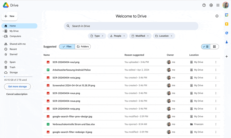
Blurring the line between Google Drive on the web and on Android seems to be a goal of the tech company, as back in November, Google revamped the app on Android tablets to provide consistency with the web version’s at-the-time new Material Design 3 theme. November was a big month for Drive, as it additionally received other updates, such as an integrated document scanner for the web and a decluttering redesign for the smartphone version. Altogether, Google gave it a massive facelift across all platforms, with its aforementioned Material Design 3 theme being fully integrated at the start of 2024.
We’re not really sure that making the search bar scroll along with the user is a necessary change. Finding the search bar hasn’t really been a problem on the web, but it seems like Google might just want to make it more prominent so users can search for their files more often instead of relying on old-school folders for navigation. If we’re being honest, though, as long as Google Drive keeps getting significant upgrades to its video transcoding technology, we don’t think anyone will care one bit about a measly search bar change.

Michael Johnson is a tech enthusiast with a passion for all things digital. His articles cover the latest technological innovations, from artificial intelligence to consumer gadgets, providing readers with a glimpse into the future of technology.